Red Is Not a Color. It’s a Decision
There are colors that accompany an artist.
And there are colors that challenge him.
For Frank Krüger, red is not a decorative choice. It is a position.
Red is the first color the eye perceives. It signals life, energy, heartbeat. Even in prehistoric cave paintings, red was the dominant pigment. Throughout art history, red has stood for power, love, revolution, danger and passion. It is never neutral.
Frank says red is the most honest color. You cannot ignore it. You may like it or reject it — but you will always react.
That is exactly why red runs like a thread through this series.
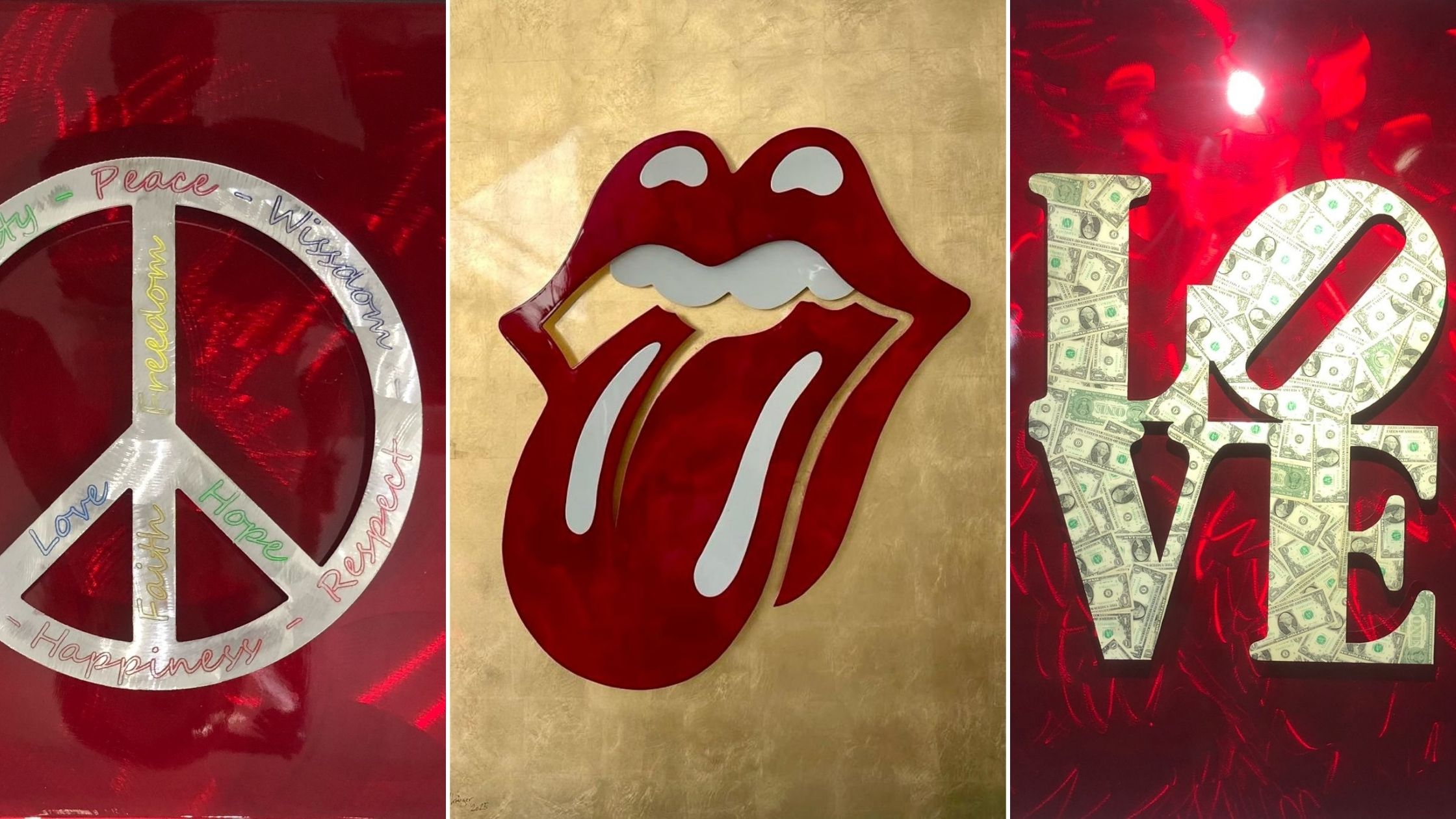
Peace — A Symbol with History
The peace sign was created in 1958 in the United Kingdom. Designer Gerald Holtom developed it for the movement against nuclear armament. The lines inside the circle combine the semaphore letters for N and D — Nuclear Disarmament.
What began as a protest symbol became a universal sign for peace.
What interests Frank is not the political slogan, but the timeless clarity of the symbol. A circle. Three lines. Everyone recognizes it instantly.
In his version, the sign stands solid on red aluminum. Engraved words such as Love, Freedom or Humanity are intentional additions. The red gives the symbol strength. It makes it less fragile, less idealistic — more decisive.
Not asking. Stating.
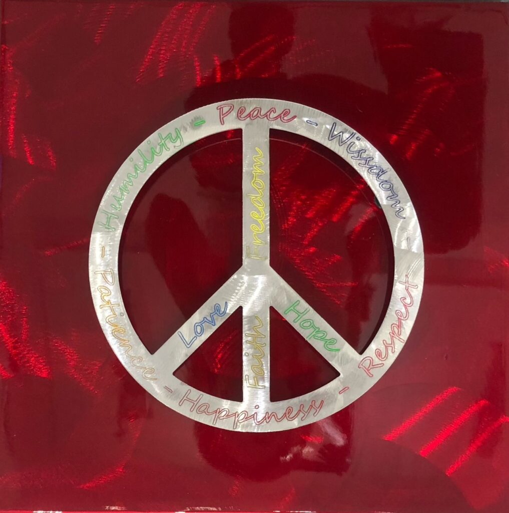
The Rolling Tongue — Rebellion as an Icon
In 1971, British designer John Pasche created the tongue logo for the Rolling Stones. It was meant to capture Mick Jagger’s expressive energy and quickly became one of the most recognizable logos in pop culture.
Few symbols represent nonconformity and confidence so clearly.
In Frank’s interpretation, the tongue gains depth. Aluminum, glossy surface, gold background. The motif remains rebellious, yet appears monumental and refined.
This is not about music.
It is about attitude.
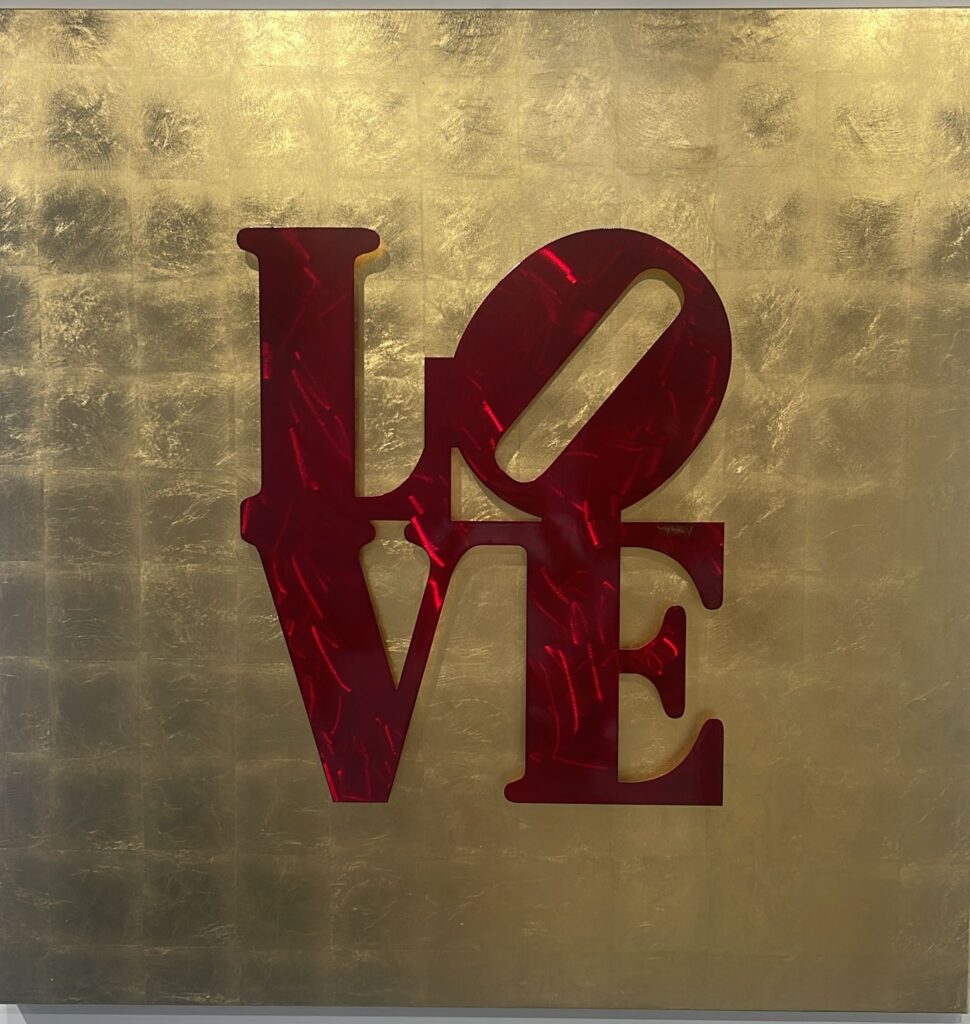
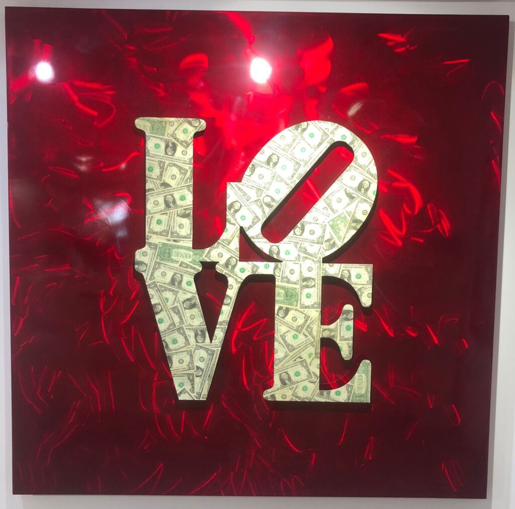
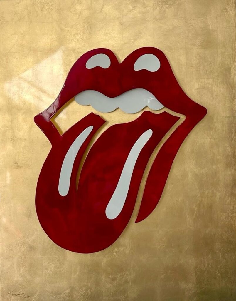
LOVE — From Word to Art
The word LOVE is not new to art. In 1964, Robert Indiana created his famous LOVE sculpture – compact, solid, block-like. A closed volume that still stands in public spaces around the world.
Frank takes up the word, but he does not quote it – he transforms it.
His sculpture is not a massive, continuous block. It consists of two metal plates mounted with space between them. In that space, air, light and shadow become part of the piece. The word appears lighter, more open, almost floating.
Love here is not a solid block. It has depth. Space in between. Movement.
In the version with red 3D letters on a golden background, a tension arises between emotion and value – red meets gold, passion meets radiance.
In the variation on a red background, the letters appear golden at first glance. On closer inspection, however, they are covered with dollar bills. A deliberate play on value and meaning. Love don’t cost a thing – at least not in material terms.
For Frank, LOVE is not a romantic motif. It is a force. An energy that drives.
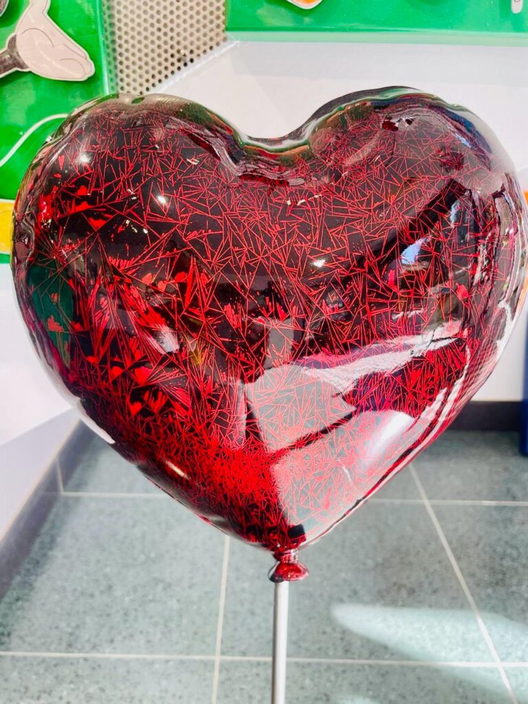
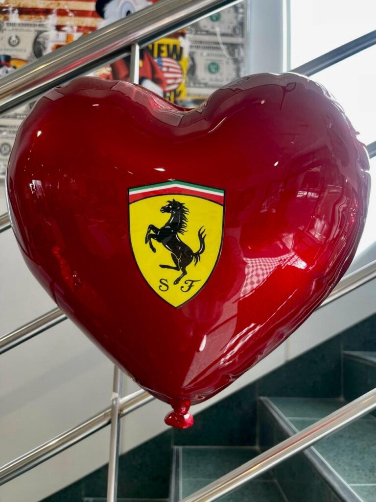
The Hearts — Light, Yet Not Naïve
At first glance, the balloon heart suggests lightness. Almost pop-art playfulness. But the cracked texture interrupts that perfection. It hints that love is never flawless.
The heart carrying the Ferrari emblem adds another layer — longing, speed, myth. Ferrari stands for passion and performance. Placed within a heart, it merges emotion with motion.
Both sculptures can hang on a wall or stand freely. Their meaning shifts with placement. Sometimes playful. Sometimes bold.
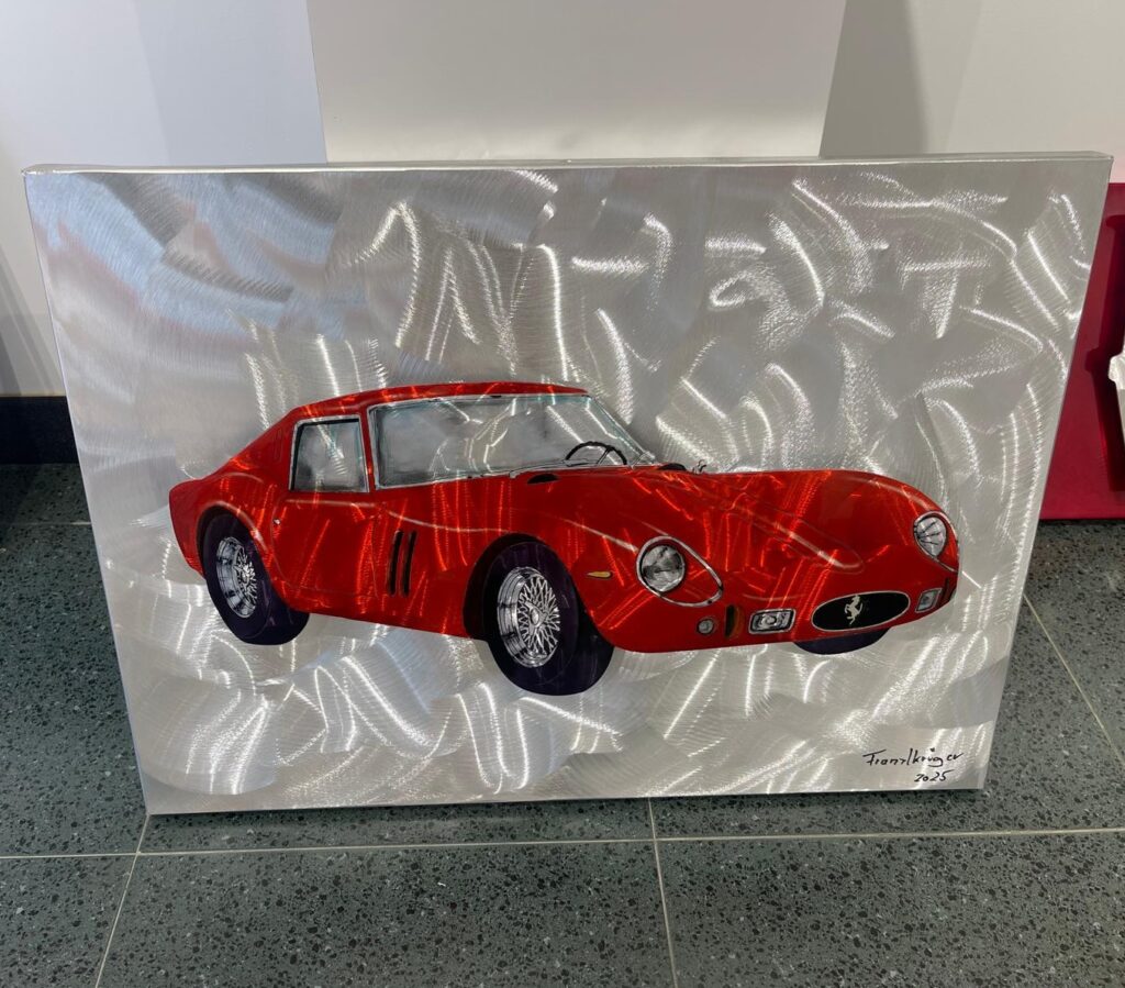
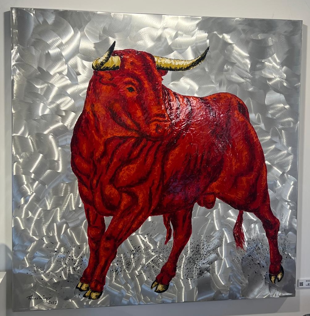
Speed and Strength
The red racing car captures a frozen moment. Oil on aluminum enhances the reflection of light. The red seems to glow.
The bull represents raw power. Determination. On cool aluminum, the motif gains tension. Warm red meets industrial clarity.
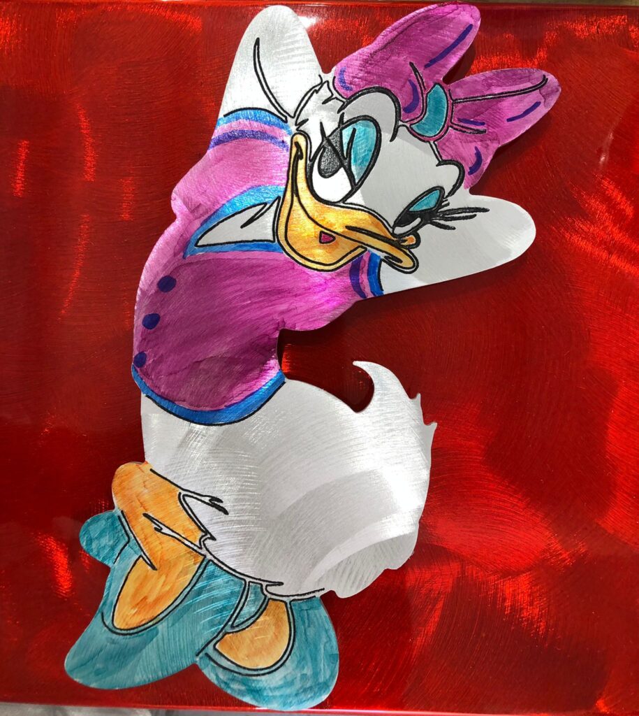
And Then Daisy
Daisy Duck first appeared in 1940 and remains one of the most recognizable figures in pop culture.
In Frank’s version, she stands against blurred red aluminum. The playful meets intensity. She is not sweet. She is present.
Why Red?
Frank says red means movement to him.
Perhaps it is his fascination with speed. Perhaps the intensity of life on Mallorca. Perhaps because red always provokes a reaction.
Red is the color of blood.
The color of love.
The color of warning.
The color of new beginnings.
Combined with aluminum, something unique happens. Cool industrial material meets emotional warmth. That contrast defines the series.
Familiar symbols. Familiar words. Familiar icons.
But concentrated. Intensified. Bound together by a color that refuses to be quiet.
Just. Red.